
Hello my dear blogglings/readers!
Guess what? Musings of an Elf has had a total redesign! If you haven’t noticed (haha). Annnd I kinda totally love it. I’ve only been meaning to redo my blog for, oh, a year or so. Not that I would ever procrastinate. No way.
……..
Ahem.
Anyway! I finally took the plunge and spent much of last week prettying up ol’ bloggy. AKA, a complete redo. Even made a new blog button!
So why the major change? Well, for starters, I was getting worried the excess of pink might run people off. Not everyone shares my affinity for pink. Eheh. So don’t worry, my few male followers, you don’t have to be ashamed about reading a pink blog anymore. You’re welcome. (Though, admittedly, it’s still rather girly. My ultra girly-ness cannot be contained. #UNASHAMED)
But more than just getting rid of the pink for people, for a long while now I’ve been wanting a much cleaner, more professional look. If I ever get a book published I want a site that at least looks like I know what I’m doing (even if it’s only pretend, shhh).
Lastly, it was just time for a change and to update things around here. I’ll miss my pink blog, but I’m super happy with the new look, and excited to have things a bit more organized and neat.
BUT I NEED YOUR HELP.
I’ve literally been tweaking this blog to death. My ability to be indecisive is so strong it could probably win an Olympic medal.
SO GIVE ME ALL THE OPINIONS.
What do you think of the header? Anything I could do to improve it? How about the sidebar? Everything look good? As for the pages, I will probably be updating them. I added an About Me page and fixed the others pages a smidge, but I didn’t have time to do everything I wanted. (Also blogger pages and me are notorious for battling. It always formats things weird and makes me want to throw my laptop out the window.) (Just kidding, I love you, Laptop. *pets it*)
Basically, I just need your overall opinions about the whole design. Are all the pictures showing up? (Another thing blogger and I fight over. >.>) Do you like how it’s all laid out?
ALSO. The thing I really need thoughts on: How do you like the font I’m using for posts? My old font was sooo small, I don’t know why I’ve been using that for so long. Again, I want a cleaner feel for easier, more pleasant reading. It’s embarrassing how long I took trying to settle on a font and font size. And I’m still totally indecisive about it. *moans* So PLEASE. Tell me! Is this font good for reading and look okay with the design? Is it too big? (DO YOU SEE HOW BAD I AM AT MAKING DECISIONS??? Even simple ones.)
DO NOT HOLD BACK YOUR OPINIONS. You will not, in any way, hurt my feelings. I write this blog for YOU GUYS, and I want to give you the best experience possible here at Musings of an Elf.
Speaking of which…
Not only am I improving the blog’s look, I want to make my content the best it can be. I think I’ve started to find my niche with blogging. (It only took my like 5 years. *rolls eyes*) But, again, I write it for YOU. I don’t want to bore you guys to death.
So my question is this:
What kind of posts do you want from me?
Are there any types of posts I do that you’re not wild about? (It’s okay! You can tell me. Please!) What kinds of posts do I write that are your favorite?
AND
Do you have any specific posts you’d like me to write?
This is mostly a writing blog, so if there are any writing thoughts/helps/questions/opinions/ramblings/etc. you want from me, TELL ME. Or just bookish discussions. Or lifely things. Or…most anything really. And you can tell me any time at all. If you ever have an idea of a post I could do, share it! I’m on a constant hunt for blog ideas (coming up with ideas every week is tiring *collapses*), and I want to make sure I’m writing things you guys actually want to read, so TELL ME WHAT TO WRITE. Share your ideas.
I absolutely love blogging and connecting with my readers and fellow blog buddies. All you guys are the BEST! *hugs for everyone* I can’t thank you each enough for being interested in my nonsensical ramblings. And I want to strive to make this place something you do actually want to continue reading.
SO GIMME YOUR THOUGHTS. (Or do I have to buy them for a penny? A penny for your thoughts…? Ahem.)
Okay, okay, I am done plaguing you guys with questions. (But my indecisiveness has no bounds! I need help.)
Well, since basically this whole POST is
questions (sheesh, Christine >.>), I really don’t need to
add more. But let’s recap: Do you like the new design?
Anything that could use tweaking? AND do you have any
types of posts you’d like to see from me? DON’T
HOLD BACK. Honest thoughts are my fave.
Girl, your design is AWESOME. But I will give you my opinion on things that may need to be improved! =)
1) Hmm..the header looks good. But I think it could use more pictures. Maybe you could include three instead of one…? Just an idea! =)
2) The sidebar is wonderful…but again, I think it could use some pictures. On some of the blogs I read, they have pictures on the sidebar. They coulb be little quote pictures, or pictures from the authors books, or whatever! I just noticed that you didn't have that on your sidebar. =)
3)Oh, and yeah, your pictures are showing up just fine!
4)Font size is fine as well. =)
5) I write, (not as much as Savannah *grin* but I do write), but I'm not as into it as some of your bloggers are. The writery posts don't draw me in very much. =) I'd like some devotional or lifey posts! =)
Oh, and one thing I wanted to say was that you have a great writing style!! Like…you have a VOICE, even when it's not in your books! =)
-Ariel
*could. Whoops. XD
-Ariel
Thank you, Ariel! And another huge THANK YOU for your honesty. SO HELPFUL.
I was actually wondering if I should do the 3 pics. My original header had 3 and I loved it, so I may change it sometime. (I just have to take pics I'll be happy with. Heh.)
I can never decide about the sidebar. It is pretty empty, but I also tend to like non-cluttered blogs. So…I don't know! If I see a pic or quote that REALLY captures me I may just have to add it to the sidebar. 😉
You know, I ALWAYS mean to do more devotion posts, but never do. So I'll definitely consider that.
AGH. *FLAILS* Girl! That is one of the NICEST things anyone has ever said to me. THANK YOU SO MUCH!!!!
Thank you for EVERYTHING. You comment was so helpful and the sweetest! <3
Your blog is beautiful! I like it!
I love all the posts about your books and writing, I find it very fun and encouraging. I especially like beautiful people, and snippets from your novels!
But life posts are cool too! It's really fun to get to know you, even just a little bit!
~Hannah~
Oh, and book reviews are really awesome too!
Thank you!!!
Posts about books and writing are honestly my favorite to make, so that makes me super happy you enjoy them! AND the Beautiful People are my top favorites. I'm so very glad the posts I tend to do the majority of you like. That's a relief, honestly! Lol. And you enjoy my snippets? *squeaks* That is so sweet! THANK YOU.
I SHOULD do more lifely posts, to be honest. And I don't do a whole lot of book review either really… So thank you for your suggestions and comments!! This was super helpful to me!
I love the new look! I'm unfortunately one of those who dislikes pink. *covers face* It's my least favorite color next to orange. XD Everything seems to be working peachy on my end. ^ ^
storitorigrace.blogspot.com
Thank you so much!
Oh, girl, THAT'S OKAY. My own sister detests pink, so I won't judge! Some colors I feel like you can be safe with. Like blue or green. Hardly anyone will say they just can't stand blue or green. But pink, and also orange, can be tricky because they can be severely disliked. XD Orange is actually my least favorite color as well, so I understand!
Anyways, I'm really happy you like the new look. ^_^
I love your new design, Christine! It's lovely! I love the open and airy look it has. I love the writer-themed posts, especially the writer advice ones, those are my favorite posts! You're an inspiring blogger, thanks for sharing your writing!
Thank you, girl!! I was going for an open, airy look, so that makes me happy! 😀
That's wonderful to hear! Because writer-themed posts are always my favorite, and tend to crop up the most. Heh. So that's very good you like them!
Aaahhhh! That's so sweet of you to say. THANK YOU! <333
YOU CHANGED YOUR BLOG DESIGN, AND IT LOOKS FABULOUS!!! Okay, so I do REALLY miss the pink (because duh, pink is the best), but I totally love the new design and think it was time for a change. 😀 In the best possible way, of course, because I've always loved how your blog looks.
The font looks GREAT! Much better than mine, that's for sure. *cough* Looking at my blog, I'm just now realizing how tiny the font is. o.o I should probably tweak that on my end, too.
As far as the design, I REALLY like it! It looks sleek and professional, but still maintains that cozy element it always has. ^_^ My only qualm would probably be that the picture on the header seems a bit too…small, maybe? I dunno, I just feel like there's not ENOUGH of it. But honestly, Lauri, the new look is ah-may-zing!
It's funny that you got rid of all the pink when I just BROUGHT BACK the pink on mine today. XD I'm honestly worried that my blog looks waaaay too uninviting. Like you said, there are some people who just plain don't like pink, and I also have a couple of guy followers. The font is also MUCH too small, and my blog just looks all around unprofessional. I DUNNO. I have insecurities about it because I'm worried about what people visiting my blog would think. BUT I do really like it so maybe I'll just keep it the way it is. *shrugs* I'M OBVIOUSLY VERY DECISIVE. XD
Anyway, LOVE the new design, Christine! Your bloggy looks all fresh and clean. ^_^
YES I DID. AND I'M SO HAPPY YOU THINK SO. 😀
Honestly, I miss the pink too (because PINK!!! <3), but I think it was for the best. And I do love this new look.
I'm glad you like the font! (I'm so silly to worry about it so much. XD) A LOT of blogs use smaller fonts, so that's okay. Yours is fine! I just felt like using something bigger because I felt like it worked better with my new look.
D'awwww! The fact that you think it's cozy here just gave me all the fuzzy-ful feels. ^_^
You know, I was wondering if the header was too small or empty or SOMETHING. I just can't get entirely satisfied with it. If I ever find time or get new inspiration, I'll probably tweak it. Thank you for saying something! That just confirmed my suspicions about it.
BUT I LOVE YOUR PINK. And I shall be commenting on your post soon here! 😀 But MARY. I adore your blog. It's such a happy place! It just makes me all happy about life every time I go to it. It's so YOU. I totally understand the insecurities though! I've been moaning and groaning about my blog FOREVERRR, never satisfied with it. But, I had to realize, it's MY blog. Ultimately, it's up to me how I want it to look. And same for you! Create your blog in a way that makes YOU happy. (But, as I said, your blog makes me so very happy and I adore it!)
THANK YOU, MARY! <333
I LOVE the new design! Very clean and crisp. The font is great! THANK YOU SO MUCH for making it bigger. Your old design was super hard to read.
If I were to suggest any tweaks at all it would be to add back in just a little color somewhere. Maybe in your post titles or something?
As far as types of posts… I enjoy reading about your writing, how you went about editing your story, your journey to publication, your Beautiful People posts, random tags, pictures of all the books you bought at the library sale… I'll admit, I'm not wild about book reviews… unless it's a book I've already read and want to "discuss" I dunno, I'm weird, don't stop writing book reviews… actually, forget I said anything. 🙂
Congrats on the new look for your blog!
EEP. Thank you! That makes me happy! And yes, I don't know WHY I've had such a small font for this long. *facepalm* I think this is much better!
It IS very colorless. I wanted a clean look, but this might be TOO clean. Lol. I'll look into that! Thanks for the suggestion! 😀
Those are ALL mostly what I love writing about. I'm very, very glad it's what people like to read!
And that's okay you're not too wild about book reviews! They're not everybody's cup of tea. I totally get that. I probably will never go book review crazy. There are just some books I like to promote and help spread the word, so I'll write the occasional one when I feel like it's necessary. But this'll never be just a book review blog. My main focus is writing. ^_^
Thank you! And thank you SOOO much for sharing your thoughts. So very helpful!
I think your new design is very lovely, especially the sidebar. <3 I'll be honest, I preferred the old design – it felt a lot more cozy and welcoming, but I do like this one and I understand that you want to look more professional.
I do like your font, but I've always loved sans serif and the way it looks with pretty cursive. If you were to keep the serif, I think something like EB Garamond might look nice? Something that's still easy to read and professional but a little unique.
I will say, the fact that your gadget titles and post font are roughly the same size is a bit odd.
I absolutely love when you share your writing (Beautiful People, snippets, basically anything where you discuss your WIPs), so more of those would be awesome!
Ahhhh, sorry that this comment was mostly negative. Oops.
Ellie | On the Other Side of Reality
Why thank you! And that's okay! I did so love my old design, but I felt the change was necessary.
Hm, very interesting thoughts on the fonts! It is such a hard balance trying to find something easy too read but something not too boring. I'll have to look into your suggestions! Thank you!
D'awwww! That makes me happy to hear! My writing tends to be the main focus here. It's a relief people do actually like reading about it. I'm honored!
No, no, no! It wasn't at all. I asked for honest opinions and I'm SO grateful to you for giving them to me. They were super helpful. Thank you so much!!!
I love the new design, it's very fresh and professional looking, but still has that softness I like about your blog. I honestly enjoy all your posts, so I think you are already doing it right. 😀
D'awww, Skye! You are the SWEETEST. That makes me so happy. THANK YOU!!! <3
I will have to comment on this at length when I have a minute to analyze actual thoughts on the new design since I do want to be helpful! But at the moment I'll just reiterate that I LOVE it on the whole and also that I love how you want feedback but also to remember to blog for YOU too… 😉
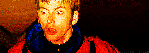
AND I just hafta say that I'm totally blaming your indecisive-DW-gif in this post for the fact that I dreamed last night that I met David Tennant at my local theater and getting him to sign something and then making him read aloud what he had written because I couldn't read his handwriting. XD …I have awesome but silly dreams sometimes. O_O I BLAME YOU FOR ALL THE DOCTOR WHO THINGS. XD …A distinction which I imagine you'll be proud to have. XDDD
Love you AND your blog and more feedback will be forthcoming at some point! 🙂
I'm so very, very happy my Celti approves of the new look! Since we're one in the same person, it just wouldn't do at all if you didn't like it!
But yes, I am learning blogging is for ME also. You can't please everybody, and it's supposed to be for FUN. I definitely have to remember that. ^_^
OH MY WORD. That is the funniest thing EVER. Especially you making him read it back because of his messy handwriting. XDDD He seems like the type to write messily. LOL. This is too great! I will gladly take the blame. *smile, smile* YOU HAVE THE BEST DREAMS.
Love you tooo! And take your time! I know you're busy. o.o
EEK, Christine, I DEFINITELY think this design is a huge improvement. Oh yes. *pets your pretty blog*
BUT since you asked for our opinions…
1.) YES, I think the font you use for the posts is very good. Perfect size. *nodnod*
2.) I would actually suggest making your page selection font a different one from the header. One that might coordinate a little better… maybe a simple, solid font in all capitals?
3.) Also, I absolutely love your content! But I haven't noticed a consistent posting schedule? I don't know, I might not have noticed one since I've been a little busy lately, but…
AND CHRISTINE. Your blog is asdkfjalsdkfj SO FUN to read, and I love it. <3
YAY!!!! I'm so very happy you think so! THANK YOU. 😀
Huh. I hadn't thought about the page selection font, but now that I look at it you're right! Having it AND the header AND the post titles all kinda the same may be too much. I'm gonna definitely play around with that. Thank you!
I actually do have a schedule. I post every single Monday. Though a couple of weeks recently I ended up posting on a Friday or two because there were special things going on. So that could be why you haven't noticed a pattern. And I tend to not notice blog schedules ever, so that's okay! XD But yeah, the majority of the time I post once a week, and usually on a Monday. *nods, nods*
D'awwww! GIRL. You make me smile so much! <3
Ohhh, I see! I'll look forward to a post every Monday, then. *hugs* <3
OKAY. So I am finally taking the time to give feedback on the blog! I'm trying to answer all your questions so I hope they'll be helpful answers. ^_^
Header: I LOVE the font! It's perfect and whimsical and elegant and easily readable and kinda professional all at once. 🙂 The image in the header… I do like it but it honestly took me a moment of trying to figure out what it was the first time I saw it? I think that's because it's so small of a portion of a picture? So if the picture was bigger I think that might help. But it's honestly okay, I'm just trying to think of possible improvements. Like, seeing the whole pic in your post, and in your adorable blog button (love!), I kind of like the whole picture. 🙂
The pages are all perfect and precious! <3 I like how they're all easy to get to up by your header. I love your about page–it's awesome. ^_^ (Your darling pics of you!! <3) And obviously your writing journey page and stories page = amazing. Oh oh, and I love how your review page has the covers to click on for reviews!! I loved it so much I may or may not have borrowed/stolen the idea in a modified form for my own blogs… *coughcough* But yup, I think they're all great!
Sidebar: It's perfect!! It has all the right things! I love your pic and "about" and aaaall of the things! <3 One tiny suggestion would be to have the instagram link to your instagram? Because for some reason I can't click the pictures — it just pops up little "share" icons on top of the pics (facebook, twitter, pinterest, and only the facebook link works? And that just takes me to a facebook sign in page which is not what I want…) sooo… I can't actually go look at your instagram unless I purposefully pop over there or… well… now I suppose I can use the handy social media icons under your profile at the top! 😀 But if there was a way to make the instagram pictures link to your account that would be helpful. ^_^
All the pictures in posts have been showing up for me, yes! There was a picture in your editing post recently where it wasn't showing up for me, but I've since checked again and it works now? But I'll probably let you know if I can't see pics because I ADORE your pics and don't want to miss out. XD But whatever you're doing lately seems to be working for the most part. 🙂 And yes, I like the layout! It all looks good. 😀
YOU ARE THE SWEETEST THING TO ANSWER ALL THE QUESTIONS! Especially when I know you're so busy. Thank you!!!
Oh good, I'm so glad you like the header font! I quite like it too. I sifted through, like, hundreds of fonts to find it. O_O But I think it was worth it!
Yeeeah, the image isn't working for me either. I think I just need to have a photography session and maybe use 3 different pics like I had in my old header or…something. I don't know. I'll figure it out sometime! Lol.
I'm glad you like the pages! Blogger HATES formatting things correctly. Like in my stories page the last bit of text is all wrong and it's driving me up the wall. I'm gonna have to fix it one of these days. But I'm glad you like it! And goodness! You like the book reviews page? That WAS just kinda temporary because, again, the text on the pages always mess up and I was too lazy to bother with it yet. XD But I may just keep it that way now!
I think the sidebar is what I'm most pleased with! ^_^ And yes! The Instagram thing is annoying. It's actually just a website that created a little widget for Instagram and I don't think I can make it link to my actual account. *pouts* I guess it's just how the widget is created. But yeah, at least I have other links to my Instagram account. I may poke around with the widget though and see if I can change things.
That one pic was actually not showing up for me either! No clue why, but when I re-uploaded it, it seemed to fix things. I don't know, blogger is persnickety. But thank you for telling me! If any pics disappear do tell! I SO appreciate it!
(Part 2 of comment since apparently it was too long to post all together… >.> *cough*)
Font for posts: The old font used to be super small, so I much prefer the new one! It's definitely not too big. I like. 🙂 *thumbs-up* The font is still really small in the comments though — I don't know why. o.o
What kind of posts do I want? ALL OF THEM! I so enjoy them all. ^_^ In general, I will say that (kind of like Jenelle said) sometimes I'm not that into book reviews if I'm not interested in the book? BUT that's just in general, and I'm always interested in what my Lauri's reading, so I do enjoy those! 🙂 Your devotional-type ones are usually so beautiful and well-written but I'll be honest and say I don't always get around to reading them right away… I know, I'm horrible. D: But it is nice to have posts for people who aren't crazy on books/writing all the time. XD And they're so much a part of the blog that it wouldn't be you without them–and I'm not suggesting you drop them or anything! I do like them. 🙂 I love aaaaall your writerly posts and bookish posts!! 😀 Your writerly ones, including BP and snippets and updates — I JUST LOVETH THEMMM. General bookish posts are some of my favorites too. <3 And I don't do much lifely posts so I totally understand not doing much of them, but I do love hearing about your life too, so whatever. ^_^ BASICALLY WRITE WHAT YOU WANT AND I WILL BE HAPPY AND HAPPILY READ IT BECAUSE I JUST LOVE YOUR BLOG AND YOU ALWAYS HAVE GREAT POSTSES. <3333
I don't have any specific ideas/suggestions for specific posts… But if I ever do, I'll let you know. 😀 Mostly, I just love all your posts and you seem to always come up with fabulous ones, so. 😉 OH OH! Though I did think it would be fun, since you work in a bookshop, to do a post about that (maybe with a couple pictures? *wriggles eyebrows*) since that's sooo cool. Like, a day in the life of a bookshop worker or something. *shrug* I just think it would be fun. 😀
And this is totally random, but I love the little green "M" icon up by the blog title on the browser tab or whatever. Pwetty. ^_^ Also the faint green coloring to some of the header thingies etc. makes me happy. 😀
SO. All of that to say I love the new blog look (fresh/clean/spacious/professional/whimsical/elegant/etc. like I said before) and your blog in general and I hope my feedback was helpful, but also I hope you'll enjoy doing your blog how YOU want, and I'm sure I'll like it however you decide to do things — because it'll be YOU! ^_^ <3
Okay, I'm done now. XD
(I'm loving all the feedback. This is great!)
The old font was so small! I have no clue why I decided on that and have stuck with it this long. *facepalm* And yes! The small font for the comments is annoying me but I haven't found a place to change it yet. Surely there's a way though!
I totally get the book review/devotion thing! This IS mostly a writing blog, so I try my best to focus on that. Just sometimes I have books I need to review or want to promote. And the devotions are mostly just to help me! Lol. Just sometimes I'll be pondering something for a while and writing it out helps me grasp the concept better. But all that to say, I will always be focusing on writing or just stories in general here the most. And those seem to be what everyone likes the most, which makes me happy!!!
GAH. Thank you, Celti! YOU make me so happy! ^_^
Do let me know if you ever have any specific ideas!
Oh my goodness. The day and the life of a bookshop worker? That'd be a ton of fun! Me likey this idea. I'll have to ponder this one. THANK YOU!
Oh, thank you! It took my the longest to figure out what to put up there. But I'm pretty happy with the little M as well. ^_^
Your feedback was SOOOO helpful! ACK. YOU'RE THE BEST, CELTI!!! And don't worry. Blogging will always be mostly for me. But I love getting ideas from other people, because my wee brain can only think up so much. XD SO THANK YOU FOR EVERYTHING!!!! This was so great! <33333
So pretty!!
D'awww, thank you! I'm happy you like it!
I'm a bit late, but I think the new design is great! I must admit that I tried to make sure no one was looking over my shoulder whenever I happened to be reading your previously pink blog, lol. The one thing I might change is the header — it does look nice, but I think it could be even better with more pictures. Just to make it pop a little more, I guess you could say.
As for post ideas, I'd love to hear your thoughts on some of your favorite movies! Although this is a blog dedicated to writing, so I'm not sure if that would really fit.
A wizard is never late. ;D
Thank you! Oh dear, I was afraid of that. All my poor male followers! I'm honored you'd still read it even with the pink. Hehe. But hopefully this is a bit better.
I agree! My last header had 3 pictures and I liked that better methinks. So I'll probably work on that sometime. *nods* Thanks so much for the feedback!
Ooh, I do love talking about my favorite movies. And hey, I could always bring in writing lessons with that. Like why those movies worked and how we can apply it to our own stories. Or…something. This is a fun idea! Thank you, Maffles!
EEEEP, CHRISTINE, THE NEW DESIGN IS GORGEOUS! I LOVE IT! I think the first time I saw the change, I was on my phone, so I didn't *really* see all the things like the header and sidebar and whatnot, but I was like, "Gasp! Musings of an Elf is different! Must go see it on a full computer screen!" You did such an awesome job cleaning/freshening it up. White is so professional, and yet the little touches with the header and the fonts and stuff add a very Christine vibe to it. ^_^
I second what Deb mentioned about the header–the first time, I had to stare at it for a second to actually identify what the picture was of. Probably because of the size? I like how the blog title runs off the edges of the picture, definitely, but if the picture could be bigger/fuller, that would be cool. (Because I love the full picture on the blog button too!)
Font size is great. I didn't overly mind the smaller size on your own blog, but this *is* easier to read. And the color scheme–love it! The updated pages are drool-worthy, and so is the sidebar… Speaking of which, is it possible to change the font of "Tweets" above your Twitter gadget? The labels of all the other things are the same except for that one, but I'm not sure if it's built into the gadget (and therefore can't be customized), or if it's actually changeable.
And your new profile pictures are so pretty! ^_^ I just noticed on the about me page that your eyes match the blog. XD
Oh, right, Deborah mentioned the little pale green M… I can't see it on my computer, for some reason. It's still showing the little pink flower up on my search bar, like it did on your old design. (On my phone, I can see the green M box, but not on the computer. Weird.)
Pictures are all showing up, except on one of the posts I read today, your profile in the comments wasn't showing up. But it seems fine now…?
Anyway, kudos to you for redesigning your blog and pulling it off so beautifully! (I may have to borrow your set up for you stories tab… Mine is in grave need of being updated. XD)
*flails* THANK YOU, TRACEY! Haha, yeah. The mobile version looks much different.
D'awww! "Christine vibe." I like that! ^_^
I agree too. The header needs some work. I'm just gonna have to take more pics until I get something I really like. Or just put the full picture instead of making it round. Or…or…something! Lol. I'll just need to dedicate some time to play with it. *nods, nods*
I'm so happy you like all the things. Thank you!
Ugh, yes. That's just part of the twitter widget. I can't change it as far as I know. It makes my OCD heart sad.
D'awww! THANK YOU. Oh my goodness, my eyes ARE kinda the same color as my blog now. That's hilarious!!! Definitely not intentional, but pretty great regardless. XDD
Huh. That is odd. I think sometimes it just takes a while to settle into the new pic. For a bit there it was sometimes showing my old one as well. I bet it'll eventually start showing the green M permanently. Blogger is just being persnickety. >.>
Really? Odd. I can't imagine why. Sheesh, Blogger, get your act together! If it keeps doing that let me know and I'll try re-uploading it. *nods*
Thank you so much, Tracey!!! Your feedback was wonderful and I SO appreciate you giving it! <3333 (Oh really? I can never be satisfied with it. Lol. But thank you!)